• Guest would you be interested in CUPRA or SEAT valve caps? let us know in the poll

  • Welcome to our new sponsor Lecatona, a brand dedicated to enhancing performance for VAG group sports cars, including SEAT, Audi, Volkswagen and Škoda. Specializing in High Pressure Fuel Pump (HPFP) upgrades.

2020 Forum and website upgrade - feeback here

What do you think of the new site?


  • Total voters
    46

Legojon

I only wanted a remap
Staff member
Moderator
Jul 7, 2015
5,309
2,739
Just for info, the top right corner of every message has a "bookmark" icon now.
1592989002920.png


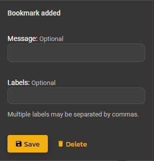
If there's a thread or guide I find particular useful. I've bookmarked the first message in it. It then gives you the option to add a message (description for yourself) and labels so you can search for it again later.
1592989076874.png


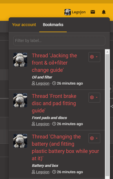
You can then access it from your profile bookmarks tab.
1592989146650.png


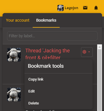
If you click the cog, you can get a link to it so you can share it without having to navigate away from the thread your replying to.
1592989187023.png
 

Damo H

Remind me, what's an indicator?
Staff member
Moderator
Oct 3, 2012
4,715
2,820
Car Length In Front
Just tested it - it's just the like option - not the other ones
Wonder if it could be updated to reflect all but the 2 negative responses?


Bit of proper feedback though. When I come to check for updates I usually go to the 'show all' link. Makes it nice and easy if I have like 10 updates.

However in both colour modes, its not as clear as the old version which are unread. I know there is a colour difference, but its a bit to subtle.

1592991910390.png

1592991929883.png


On the old software it would have an asterisk next to any new ones.

Could the colour difference be bigger, or a symbol added. Maybe a Seat S for light mode and a Cupra logo for dark mode?
 
  • Like
Reactions: Syphon

Damo H

Remind me, what's an indicator?
Staff member
Moderator
Oct 3, 2012
4,715
2,820
Car Length In Front
Just for info, the top right corner of every message has a "bookmark" icon now.
View attachment 15653

If there's a thread or guide I find particular useful. I've bookmarked the first message in it. It then gives you the option to add a message (description for yourself) and labels so you can search for it again later.

View attachment 15654

You can then access it from your profile bookmarks tab.

View attachment 15655

If you click the cog, you can get a link to it so you can share it without having to navigate away from the thread your replying to.

View attachment 15656
Now that is ****ing cool and handy!! THe number of times I've had to search for half an hour to find one post I vaguely rememeber haha
 
  • Like
Reactions: Legojon

Syphon

Site Owner
Staff member
Feb 28, 2002
9,434
2,171
South West
www.seatcupra.net
Wonder if it could be updated to reflect all but the 2 negative responses?


Bit of proper feedback though. When I come to check for updates I usually go to the 'show all' link. Makes it nice and easy if I have like 10 updates.

However in both colour modes, its not as clear as the old version which are unread. I know there is a colour difference, but its a bit to subtle.

View attachment 15677
View attachment 15678


On the old software it would have an asterisk next to any new ones.

Could the colour difference be bigger, or a symbol added. Maybe a Seat S for light mode and a Cupra logo for dark mode?


OK so I'd not checked properly the reactions work as follows in relation to your like count

1592992254471.png


Regarding the styling of new posts - yes the colour is a bit too subtle. Will see what can be done.
 
  • Like
Reactions: Damo H

Tees_FR

Active Member
Sep 15, 2019
45
8
I particularly like the cupra dark mode. Not sure if it is just my PC that doesn't support the file type, but the smilies look like this for me...
1593001636892.png
 

Vaios_Greece

Active Member
Jun 11, 2020
18
8
Signed up not long ago , so i didn't have much time to get used to the old interface in order to compare them. But from the first impressions , it seems user friendly and more eye-candy than the old one. So my best wishes to everyone involved and many thanks for providing such a space for us!!
 
  • Like
Reactions: Lozzy15 and Syphon

Syphon

Site Owner
Staff member
Feb 28, 2002
9,434
2,171
South West
www.seatcupra.net
Signed up not long ago , so i didn't have much time to get used to the old interface in order to compare them. But from the first impressions , it seems user friendly and more eye-candy than the old one. So my best wishes to everyone involved and many thanks for providing such a space for us!!

Thanks for the nice feedback. :cool:
 

Damo H

Remind me, what's an indicator?
Staff member
Moderator
Oct 3, 2012
4,715
2,820
Car Length In Front
Glad you like it - yes the smilies need sorting (see 2nd post of known issues) - I've moved them just now so they at least don't come up first.

Cheers,

Scott
If I'm honest, those other emoji's were looking a bit dated and not sad to see them go.

Would be happy with a slightly expanded set of the ones that are already working.

Besides aren't the emojis used on iOS, WhatsApp,all linked to the same thing. Could they be linked to that too? Or is that mo money and mo problems...
 
  • Like
Reactions: Tees_FR

Syphon

Site Owner
Staff member
Feb 28, 2002
9,434
2,171
South West
www.seatcupra.net
If I'm honest, those other emoji's were looking a bit dated and not sad to see them go.

Would be happy with a slightly expanded set of the ones that are already working.

Besides aren't the emojis used on iOS, WhatsApp,all linked to the same thing. Could they be linked to that too? Or is that mo money and mo problems...

Looking to have the old emoji's reinstated for old posts so they don't have gobbly gook in them, but not allow them to be added to new posts. They won't look good in dark mode though as they don't have transparent backgrounds/edges.

Yes on device stuff should work I think, not tested it yet.
 
Progressive Parts, performance parts and tuning specialists