I read the review here, but I also watched a comparative review from my trusted Dutch automotive magazine (video with English CC subtitles).
Long story short; They find the Leon to be more concise & comfy at low & cruise speeds than the Focus, but it's also more composed at
high speeds than the Focus:
So, automotive-wise I trust Autoweek's statement that Seat have yet again delivered something excellent.
But yeah...styling-wise..... that's where subjective preference comes into play. I've often seen the argument "But, you gotta see it in person to truly appreciate it.."
Well, that doesn't ring true to me - Design elements which irk me at product preview & launch, remain to irk me years after said product has been on the market.
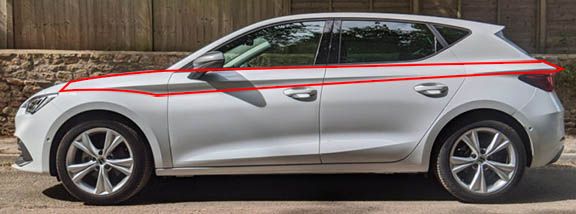
Take for example the MK4's side profile crease;

It's almost a straight horizontal line, raised up all the way to the cabin windows. Straight lines are usually boring imho.
Also, the side effect is a visual emphasis so high upwards, that it feels "Top Heavy".
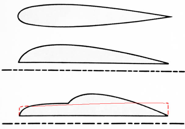
After all, ideal aerodynamic airflow in automotive context is half a rain drop shape; that is the reason why I love
the side crease on the MK2 so much because it references this concept.
The MK4 however, sort of superimposes a straight line high up. I realize the original intent of the design is probably something
like a levitating vector denoting 'speed', but I can't help but feel that it makes the car silhouette feel more box-like from quite a few angles in my opinion.
And overall...the MK4 design feels schizophrenic - as if it can't make up it's mind style-wise...literally an amalgamation of style directions. Not my cup of tea.

Long story short; They find the Leon to be more concise & comfy at low & cruise speeds than the Focus, but it's also more composed at
high speeds than the Focus:
So, automotive-wise I trust Autoweek's statement that Seat have yet again delivered something excellent.
But yeah...styling-wise..... that's where subjective preference comes into play. I've often seen the argument "But, you gotta see it in person to truly appreciate it.."
Well, that doesn't ring true to me - Design elements which irk me at product preview & launch, remain to irk me years after said product has been on the market.
Take for example the MK4's side profile crease;
It's almost a straight horizontal line, raised up all the way to the cabin windows. Straight lines are usually boring imho.
Also, the side effect is a visual emphasis so high upwards, that it feels "Top Heavy".
After all, ideal aerodynamic airflow in automotive context is half a rain drop shape; that is the reason why I love
the side crease on the MK2 so much because it references this concept.
The MK4 however, sort of superimposes a straight line high up. I realize the original intent of the design is probably something
like a levitating vector denoting 'speed', but I can't help but feel that it makes the car silhouette feel more box-like from quite a few angles in my opinion.
And overall...the MK4 design feels schizophrenic - as if it can't make up it's mind style-wise...literally an amalgamation of style directions. Not my cup of tea.
Last edited:


